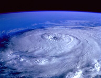
During hurricane season, a storm that is still far from land can fill weather maps with thin, twisting lines. These are often called spaghetti models, and they can make a forecast look both scientific and chaotic. One line may bend toward the coast. Another may turn out to sea. A few may run far from the rest, raising worry before the official forecast has even settled.
The lines are useful, but they are easy to misread. A spaghetti plot is not a list of promises, and it is not a contest where one line is secretly the winner. It is a way to compare many possible storm tracks, usually produced by computer forecast models or groups of related model runs. The real value comes from noticing patterns: whether the lines cluster together, spread apart, shift from one update to the next, and match the larger environment around the storm.
What the Lines Actually Show
A hurricane track forecast begins with a snapshot of the atmosphere and ocean. Forecasters need to know where the storm is, how strong it is, what steering winds surround it, how warm the water is, where dry air sits, and how pressure systems may move over the next several days. Because the atmosphere is huge and constantly changing, no snapshot is perfect. Small differences at the start can grow into larger differences days later.
Computer models use physics to project how the storm may move. Some models simulate the whole atmosphere across the globe. Others focus more closely on tropical cyclones. Ensemble forecasting adds another layer by running related forecasts many times with slightly different starting conditions or model settings. When those possible tracks are plotted together, the map can look like a pile of noodles, which is where the nickname comes from.
Each line usually represents the predicted path of the storm’s center, not the full area of wind, rain, surge, or tornado risk. That distinction matters. A hurricane is not a point on a map. Its hazards can extend far from the center, especially on the side where wind pushes water toward shore or where rain bands train over the same places for hours. A line passing offshore does not automatically mean a coast is safe, and a line passing inland does not show exactly where the worst damage will occur.
Why the Cluster Matters More Than One Track
The biggest mistake is picking the line that points closest to home and treating it as the forecast. That line may come from one model run, one member of an ensemble, or one scenario that is possible but not especially likely. A better first question is whether most of the lines are telling a similar story. When the tracks bunch together, the forecast has more agreement about the general direction. When they fan out widely, the storm’s future is still unsettled.
Clustering does not make a forecast certain. It only shows that several models or ensemble members are responding to the current setup in similar ways. If a strong ridge of high pressure is steering the storm west, many lines may move west together. If a dip in the jet stream is expected to pull the storm north, many lines may curve north together. If models disagree about the strength or timing of either feature, the lines may split into different camps.
Those camps are often more useful than the individual strands. One group may show an early turn. Another may show a later turn. A third may keep the storm weak enough that low-level winds steer it differently. Forecasters study why the groups differ, not just where they end up. The map is a clue to the forecast problem: which steering feature matters, when a turn might happen, and how quickly confidence is changing.
How Time Changes Forecast Confidence
Spaghetti models usually become less reliable the farther they look into the future. A forecast for the next 24 hours starts with a better-known storm and a shorter chain of atmospheric changes. A forecast five days out has more room for small early errors to grow. That is why a tight group of tracks near the current storm can spread into a wide fan later in the forecast period.
The National Hurricane Center’s official cone is built around this same idea of track uncertainty. The standard cone does not show every hazard and does not promise that impacts stop at its edge. It shows a probable area for the storm center based on past forecast errors. For 2026, the hurricane center also described product updates, including changes to how wind watches and warnings are displayed and an experimental cone approach that uses ellipses to better represent along-track and cross-track forecast error.
Spaghetti plots and the official cone answer related but different questions. The spaghetti plot shows model spread. The official forecast represents expert judgment after forecasters weigh models, observations, storm structure, and known model biases. When the two seem different, the official forecast deserves more weight. Forecasters are not simply averaging every line; they are interpreting which guidance is most trustworthy for that storm and that weather pattern.
Why Models Disagree
Models disagree because the atmosphere does not hand forecasters a perfectly measured starting point. Weather balloons, satellites, aircraft, radar, ocean buoys, and surface stations all fill in pieces of the picture, but some areas are still measured better than others. Over the open ocean, a storm may be far from dense observing networks. When hurricane hunter aircraft sample the storm and its surroundings, forecasts can improve because the models begin with better information.
Storm strength also changes the track. A stronger hurricane can feel winds at higher levels of the atmosphere, while a weaker tropical storm may be steered more by lower-level winds. If models disagree about how much dry air, wind shear, or warm water will affect the storm, they may also disagree about the path. Track and intensity are connected, even though maps often separate them.
Timing is another source of disagreement. A storm may be forecast to turn north when a trough approaches, but a turn that happens six hours earlier or later can shift the track by many miles. A high-pressure ridge that weakens sooner than expected can open a path away from land. If it holds longer, the storm may travel farther west before turning. Spaghetti lines often spread because models are testing different timing in a very sensitive setup.
Reading the Map Like a Forecaster
A careful reading starts with the official advisory time. Old spaghetti plots can circulate long after new data has changed the forecast. Always check whether the map matches the latest advisory cycle, especially if a storm is near land or changing quickly. A six-hour-old map can already be stale when a storm is strengthening, reorganizing, or approaching a turn.
Next, look at the early part of the tracks before studying the far end. If the lines diverge almost immediately, the forecast has a basic location, structure, or steering uncertainty. If they stay together for two or three days and then spread apart, near-term confidence is higher while the longer-range forecast remains open. That difference helps separate immediate planning from watchful waiting.
Then compare the model spread with official watches, warnings, and local emergency guidance. Watches and warnings are based on hazards and timing, not on a favorite spaghetti line. A community outside the exact center track can still face dangerous rain, wind, coastal flooding, or tornadoes. Emergency decisions should never wait for every model line to agree, because perfect agreement may not arrive before conditions deteriorate.
- Do not chase single lines. Look for clusters, shifts, and repeated trends across updates.
- Check the forecast age. New observations can change model guidance quickly.
- Separate track from hazards. Wind, rain, surge, and tornado risk can spread far from the center.
- Use official forecasts for decisions. Spaghetti plots are guidance, not the final public warning.

What a Shift From Run to Run Can Mean
One update rarely tells the whole story. A single jump east or west may be noise, especially far from land. A repeated shift across several runs carries more meaning. If several model cycles gradually move toward the same area, confidence may be increasing. If the tracks jump back and forth, the forecast environment may still be too uncertain for narrow conclusions.
Forecasters also watch whether the official track moves with the model cluster or holds steady despite it. Sometimes guidance changes because better data has arrived. Sometimes a model overreacts to a feature that may not develop. Human forecasters can compare the guidance against satellite trends, aircraft observations, past model performance, and the physical setup around the storm.
The most useful habit is to read spaghetti models as a conversation among possible futures. The lines are not trying to scare people, and they are not a guarantee that every place under a strand will be hit. They show uncertainty in motion. Used well, they can make the official forecast easier to understand: confidence is higher where guidance agrees, lower where it spreads, and most important where hazards may reach people even away from the center.
The Better Question to Ask
When a spaghetti plot appears online, the first reaction is often personal: Is the line coming toward me? A better question is broader: What does the spread say about confidence, timing, and possible hazards? That question keeps attention on the forecast instead of on the most dramatic strand.
Hurricane preparation depends on lead time. Families need time to review supplies, check evacuation zones, protect documents, help neighbors, and follow local instructions. Model guidance helps show when uncertainty is shrinking and when risk is becoming more focused. It should sharpen attention, not replace official forecasts or local warnings.
Spaghetti models are most helpful when they are treated as one part of a larger forecast picture. The cluster matters. The spread matters. The trend from one update to the next matters. The official advisory matters most. Read that way, the tangled lines become less like confusion on a map and more like an honest picture of how forecasting works when a powerful storm is still choosing its path.


Add comment