

 Akshay Dinesh
Checking the air quality can feel oddly confusing. One app says the AQI is 72, another shows 118, and a neighborhood sensor map may flash an even higher number a few blocks away. The sky might look hazy, or it might look perfectly normal, which makes the disagreement feel even stranger.
The mismatch does not always mean one source is careless. Air quality readings are built from measurements, estimates, timing choices, and health-based formulas. Different tools may answer slightly different questions: what official monitors report, what nearby low-cost sensors are detecting, what a forecast model expects later, or what one pollutant looks like right now. Once those pieces are visible, the numbers become easier to read.
AQI Turns Several Pollutants Into One Health Scale
The Air Quality Index, or AQI, is not a direct measurement like temperature. It is a health-based scale used to describe how polluted the air is likely to feel for people. In the United States, EPA’s AirNow system uses familiar color categories: green for Good, yellow for Moderate, orange for Unhealthy for Sensitive Groups, red for Unhealthy, purple for Very Unhealthy, and maroon for Hazardous.
That single number can represent different pollutants. Fine particle pollution, often called PM2.5, matters during wildfire smoke events because the particles are small enough to reach deep into the lungs. Ground-level ozone is often more important on hot, sunny days when pollution-forming chemicals react in the air. Other pollutants can matter too, but many daily air-quality checks focus on particles and ozone because they commonly drive health warnings.
The AQI is designed so that a higher number means greater concern, but the number is calculated from pollutant concentrations. That extra step matters. Two apps may show different values if one is emphasizing PM2.5 while another is showing ozone, or if one reports the current pollutant that is highest while another is showing a forecast for later in the day.
Official Monitors and Local Sensors Do Different Jobs
AirNow relies heavily on regulatory-grade monitors operated by federal, state, local, tribal, and partner agencies. These monitors are carefully maintained and quality checked, which makes them important for official health information. The tradeoff is that they are not on every street. A city may have only a few official monitors spread across a large area.
Low-cost sensors can fill in some of that local detail. A sensor on a school roof, a library, or someone’s porch may detect smoke or dust closer to where people actually live. During wildfire season, that neighborhood detail can be useful because smoke does not spread evenly. Wind, hills, buildings, and distance from a smoke plume can create sharp differences across short distances.
Those sensors have limits. EPA notes that out-of-the-box sensor readings are not the same as data from regulatory-grade monitors. Humidity, placement, maintenance, smoke density, and device design can all affect results. That is why AirNow’s Fire and Smoke Map uses quality-control steps and correction methods before displaying certain low-cost sensor data beside official monitors and temporary fire monitors.
When an app leans heavily on low-cost sensors, it may react faster to a nearby smoke patch. When another source leans on official monitors, it may look steadier and less jumpy. Neither style is automatically useless. They simply give different views of the same air.
Timing Can Change the Number Before the Air Changes
AQI disagreements often come down to time. Air pollution does not move like a light switch. Smoke may arrive in waves, traffic pollution can build during rush hour, and ozone often rises later in the day after sunlight drives chemical reactions. A number based on the last few minutes can look very different from one based on a longer average.
AirNow uses a method called NowCast for current particle pollution and ozone reporting. The idea is to make the AQI responsive when conditions are changing quickly, while still avoiding wild swings from every brief spike. During smoke events, that balance matters because people need a number that is current enough to guide outdoor decisions but stable enough to avoid overreacting to noise.
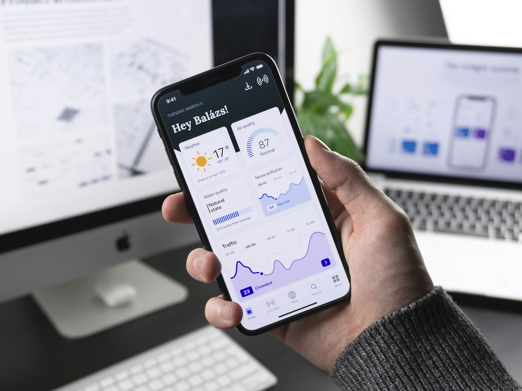
Apps may also mix current readings and forecasts in ways that are easy to miss. One screen might show the current AQI, another may show today’s expected peak, and a weather app may show a forecast category for the afternoon. If a person compares those numbers as if they are all measuring the exact same moment, the result can look contradictory.
A useful habit is to check the label beside the number. Words such as current, forecast, hourly, daily, PM2.5, ozone, or sensor can explain much of the difference before there is any need to decide which source is more trustworthy.
Location Matters More Than People Expect
Air quality can change across a town for ordinary reasons. A monitor near a highway may pick up more traffic pollution than one near a park. A valley may trap smoke while a nearby ridge has cleaner air. A sea breeze, thunderstorm outflow, or shifting wind can move pollution boundaries faster than a person expects.
Indoor and outdoor air can differ too. A classroom with good filtration may feel fine while the outdoor AQI is elevated. A room with open windows, a weak filter, or a nearby pollution source may not match the outdoor number very well. The AQI is a guide to outdoor air quality, not a perfect reading of every room, bus stop, playground, or sports field.
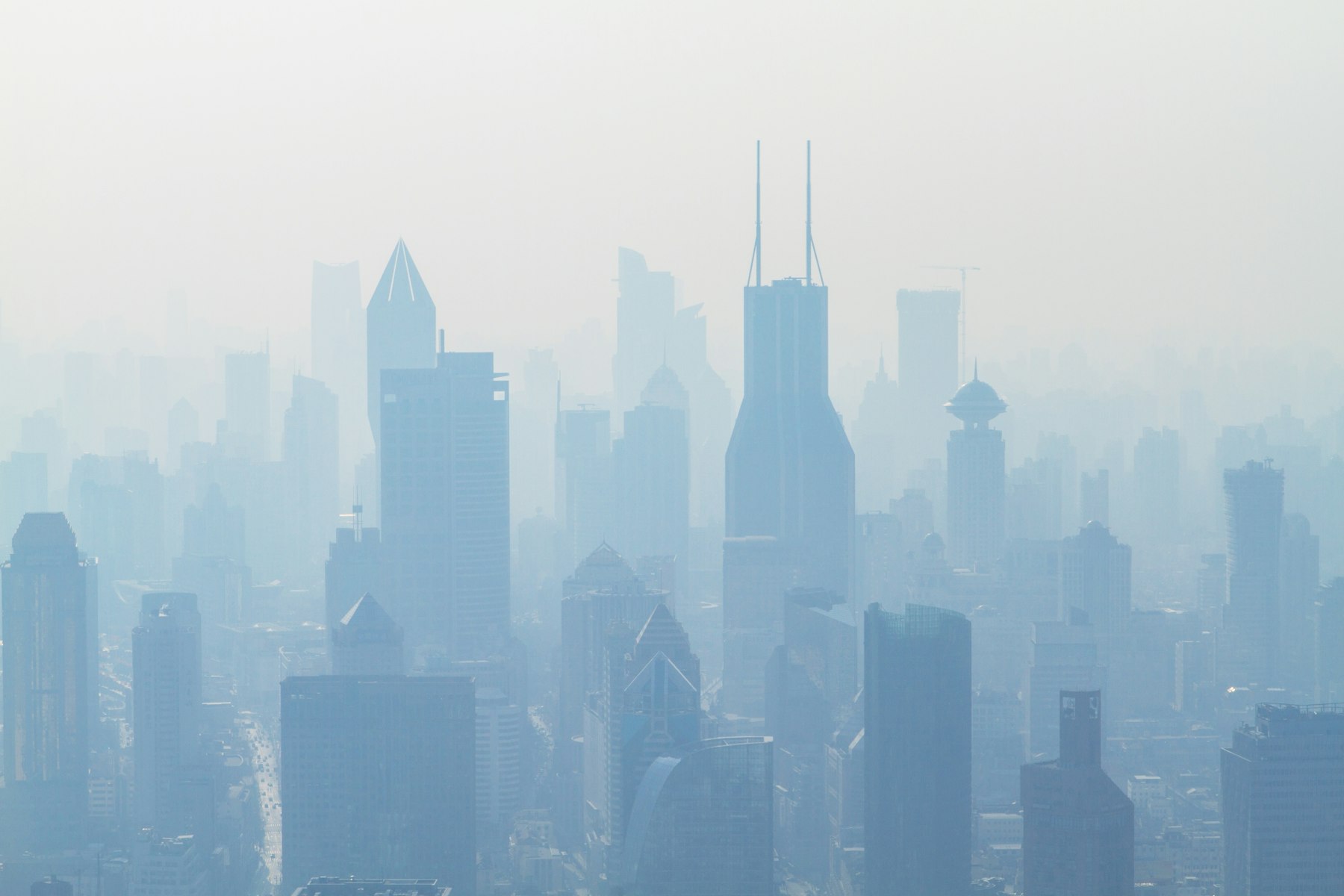
Small location differences are especially noticeable during wildfire smoke. Smoke can sit in one neighborhood and miss another, then reverse later in the day. That is why map views often show patches rather than smooth circles. A nearby sensor may be useful, but a single sensor can also be affected by its exact placement, such as being too close to a grill, driveway, vent, or dusty surface.
For everyday decisions, it helps to compare the nearest reliable readings with what is happening outside. Haze, smoke smell, irritated eyes, or visible ash are not replacements for data, but they can warn that conditions are changing faster than a broad city forecast shows.
How to Read Conflicting AQI Reports Sensibly
The safest way to read AQI disagreement is not to hunt for the lowest number. Start with an official source such as AirNow for the health-based baseline, especially when schools, practices, field trips, or outdoor work are involved. Then use local sensor maps as supporting detail, particularly during wildfire smoke when pollution can vary block by block.
When numbers disagree, look for the reason rather than treating the apps like a contest. Check whether the reading is current or forecast. Check whether it is based on PM2.5, ozone, or an overall daily AQI. See whether the source is using official monitors, low-cost sensors, satellite estimates, weather models, or a blend of several inputs.
- If one source is much higher, treat it as a signal to look closer, especially if smoke is visible or people nearby are coughing, wheezing, or feeling irritation.
- If official and sensor readings are close, confidence is usually stronger because different measurement systems are telling a similar story.
- If a single neighborhood sensor is extreme, compare it with nearby sensors before assuming the whole area has the same air.
- If conditions are changing quickly, refresh the reading and pay attention to trend direction, not only the exact number.
The CDC advises people to pay attention to the AQI because it helps show when outdoor air may not be safe for everyone. Sensitive groups, including people with asthma, heart or lung disease, children, older adults, and pregnant people, may need to act at lower AQI levels than the general public. That is why the color category can be more useful than arguing over a few index points.
The Best Number Is the One You Understand
AQI apps can disagree because air is complicated and the tools are not all built the same way. Some emphasize official monitors, some pull in neighborhood sensors, some forecast later conditions, and some combine several streams of data into one polished display. The result can be frustrating, but it also shows how much information is now available compared with a single citywide report.
The goal is not to memorize every calculation behind the number. It is to read the number with context. Ask what pollutant is driving the AQI, where the data came from, how current it is, and whether nearby conditions support what the screen says.
When the air is clearly unhealthy, small differences between apps matter less than the decision they point toward: reduce heavy outdoor activity, move sensitive activities indoors, close windows during smoke, improve filtration when possible, and keep checking for changes. A good AQI reading is not just a number on a phone. It is a tool for noticing invisible conditions early enough to make better choices.