 Akshay Dinesh
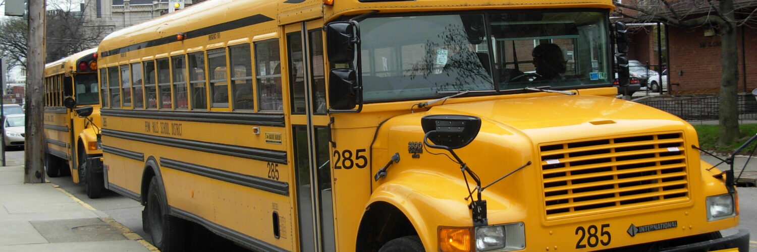
A school bus could have been painted almost any bright color. Red would have looked urgent. Green might have seemed friendly. Blue would have stood apart from fire trucks and warning signs. Yet across the United States and Canada, the familiar answer is a strong yellow-orange shade officially known as National School Bus Glossy Yellow.
That choice is not just tradition. The color sits at a useful meeting point between visibility, contrast, recognition, and public habit. A school bus needs to be noticed in morning traffic, late-afternoon glare, rain, fog, tree shade, and busy streets where drivers are already processing signs, lanes, pedestrians, parked cars, and signals. Yellow does not make a bus safe by itself, but it helps the bus announce itself before a driver has time to think very hard about what it is.
The Color Was Chosen to Solve a Practical Problem
Before school buses became visually standardized, student transportation looked much less uniform. Some districts used whatever vehicles and colors were available. In 1939, education professor Frank W. Cyr of Teachers College, Columbia University helped organize a national conference on school bus standards. The meeting brought together transportation officials, bus manufacturers, paint specialists, and educators to settle practical questions about school bus design.
Color was one of those questions. The goal was not to make buses cheerful or decorative. It was to make them easier to identify from a distance and easier to read in less-than-perfect light. The conference considered a range of yellow, orange, and red-orange shades before settling on the color that became the school bus standard.
The choice mattered because school buses are not ordinary vehicles. They stop often, carry children, and create moments when students may be walking near traffic. A bus that looks different from delivery trucks, passenger cars, and public buses gives other drivers a faster visual cue: slow down, pay attention, and expect children nearby.
Why Yellow Catches the Eye So Well
Human vision is not equally sensitive to every color. In daylight, the eye relies heavily on cone cells that respond to different ranges of light. The yellow-orange used on school buses strongly stimulates the parts of vision that help people notice bright objects in normal outdoor conditions. It is not a magic color, but it is a very efficient one for a large vehicle that needs to stand out.
Yellow also performs well in peripheral vision. Drivers do not always look directly at a bus the instant it appears. They may first notice it at the edge of their field of view while watching the lane ahead, checking mirrors, or scanning an intersection. A strong yellow-orange shape gives the eye something conspicuous to catch before attention fully shifts toward it.
There is another advantage: the color is unusual in traffic. Red is already used for brake lights, stop signs, emergency vehicles, and signals. Green can blend into trees, lawns, and roadside signs. White and gray can disappear into overcast skies, concrete, and bright glare. School-bus yellow is warm, saturated, and distinctive enough that it quickly becomes a category in the mind, not just a color on a vehicle.
Black Lettering Makes the Yellow Work Harder
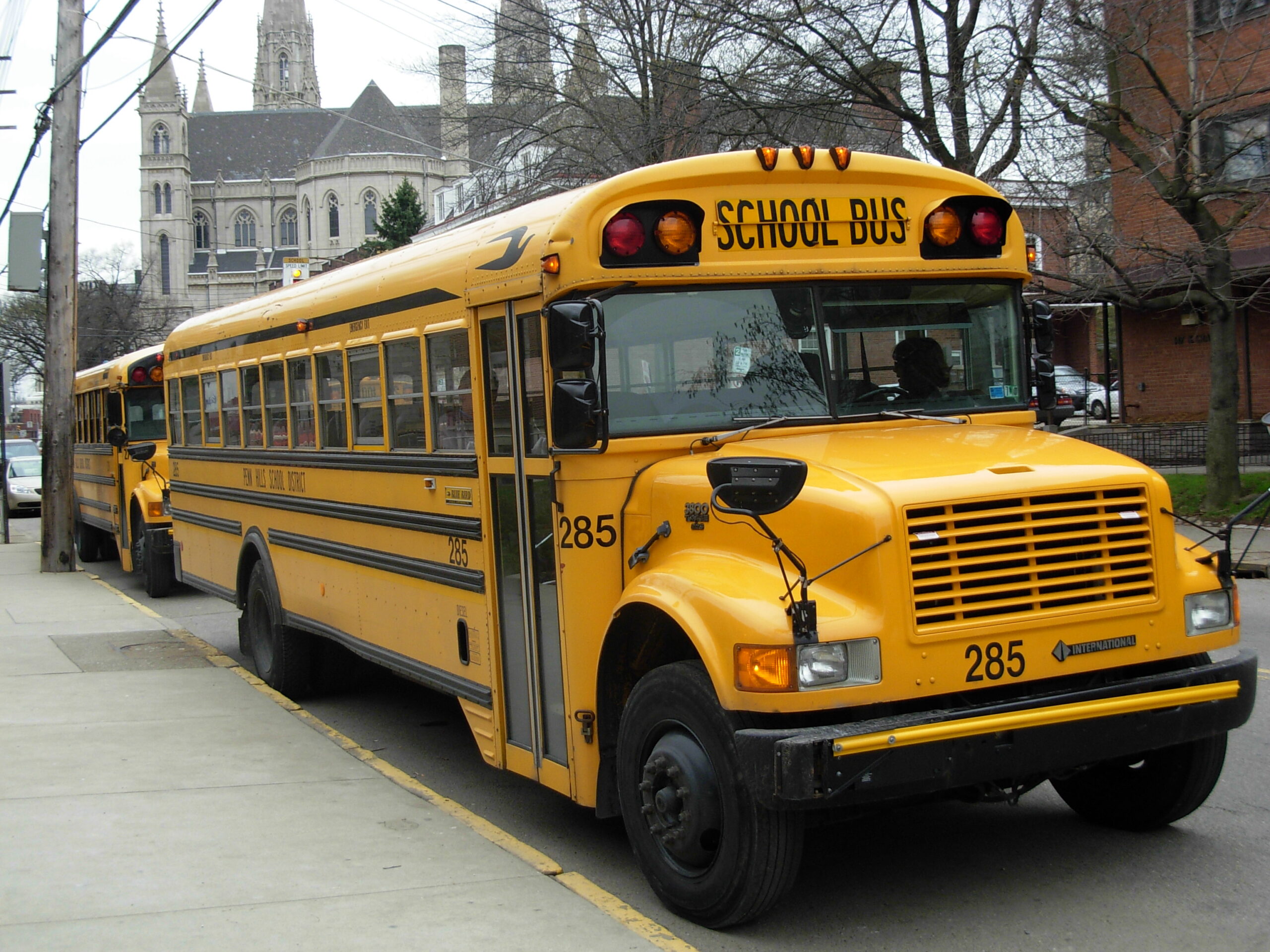
The color of the bus is only part of the design. The black trim and black lettering are just as important. Black text against a yellow background creates strong contrast, which helps the words “SCHOOL BUS” remain readable at a distance and in uneven light. That contrast is one reason the 1939 color discussion focused not only on brightness, but also on legibility.
Contrast matters because a driver often has only a brief moment to recognize what is ahead. The vehicle’s shape, color, roof lights, black lettering, and stop arm work together. A yellow rectangle alone might catch attention, but a yellow vehicle with readable black school-bus markings carries a clearer message.
This is why the color is closer to yellow-orange than lemon yellow. A pale yellow might be bright, but it can wash out in sunlight. A deeper orange might be visible, but it could compete with other warning colors and reduce the clean contrast that makes the sign readable. The standard color sits between those extremes.
Yellow Is Only One Layer of School Bus Safety
It would be misleading to say school buses are safe simply because they are yellow. The color is a signal, not a shield. Modern school bus safety also depends on size, structure, trained drivers, seating design, mirrors, flashing lights, stop arms, loading routines, and laws that require other drivers to stop when children are boarding or leaving.
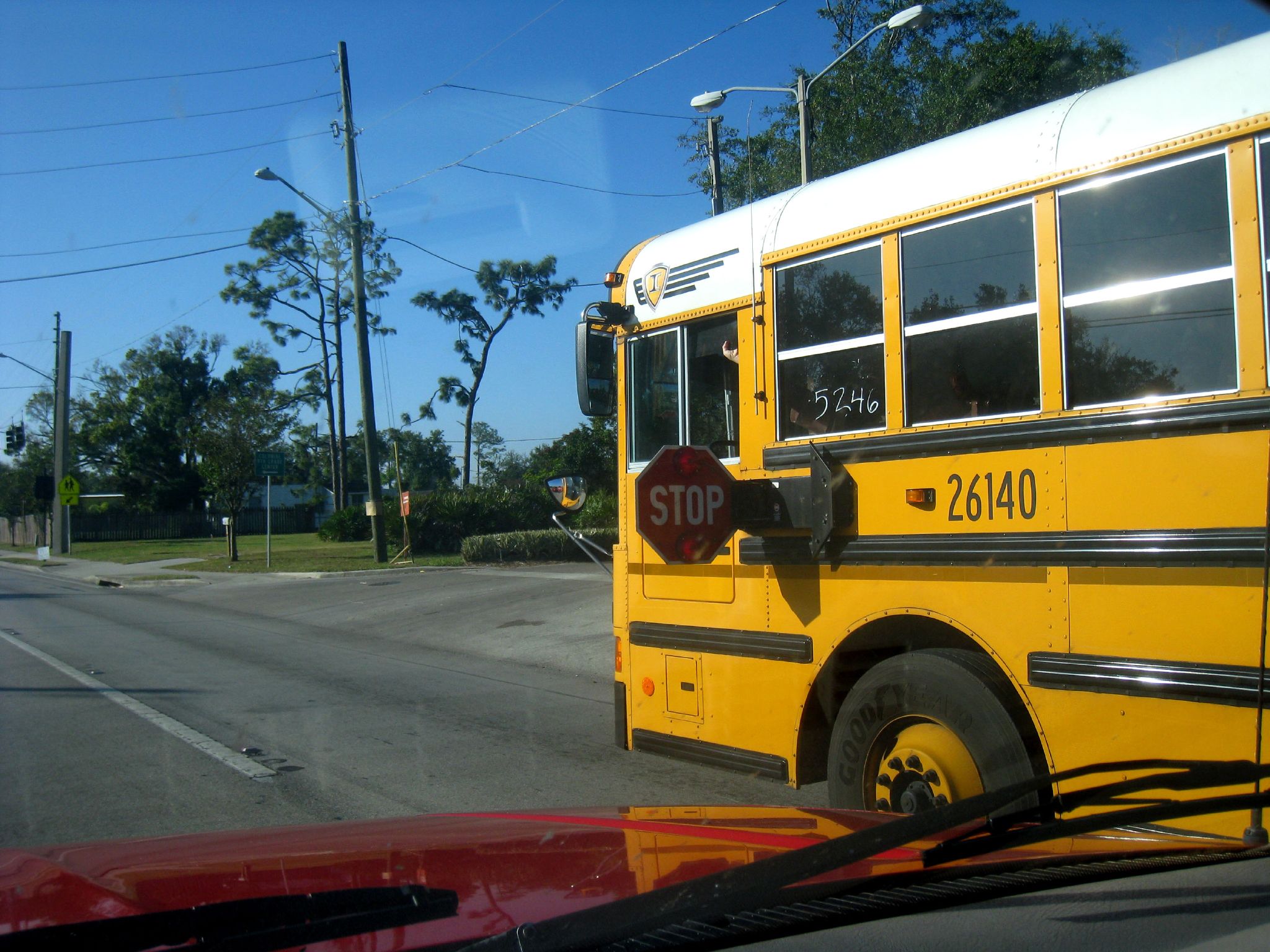
The National Highway Traffic Safety Administration has long emphasized that the most dangerous moments often happen outside the bus, especially when drivers illegally pass a stopped school bus. This is why the red flashing lights and stop arm are so important. The yellow bus gets attention; the red stop signal gives a command.
These signals are deliberately layered. Yellow body color helps drivers recognize the vehicle early. Amber lights warn that the bus is preparing to stop. Red flashing lights and the extended stop arm tell traffic to stop. Mirrors and driver procedures help watch the space around the vehicle. Each part reduces a different kind of risk.
Standards Turn Recognition Into a Habit
A single yellow bus is noticeable. Thousands of yellow buses, seen year after year, become a public language. That is the hidden strength of standardization. Once a color and design are used consistently, people do not need to reread the situation from scratch every time. The bus itself becomes a familiar warning that children may be nearby.
Federal safety rules and guidance have shaped school bus design in many ways, though the legal details of bus color are more complicated than many people assume. NHTSA has explained that federal motor vehicle safety certification rules do not themselves require a newly manufactured bus to be painted yellow. The color has instead been tied to operational pupil transportation standards and state or local adoption. In everyday life, though, the result is clear: the yellow school bus became a widely recognized safety symbol.
Recognition also helps children. A consistent bus color makes it easier for younger students to identify the correct kind of vehicle, especially in busy pickup and drop-off areas. That does not replace supervision or safe routines, but it supports them. Good design often works this way: it reduces confusion before anyone has to explain the rule again.
Why the Answer Is Bigger Than Color
The simple answer is that school buses are yellow because yellow is highly visible. The better answer is that school-bus yellow combines visibility, contrast, standardization, and meaning. It catches the eye, supports readable black lettering, stands apart from many ordinary vehicles, and has been repeated so often that drivers recognize it almost instantly.
That makes the color a small but clever piece of public safety design. It turns a vehicle into a signal. The paint does not drive carefully, extend the stop arm, check the mirrors, or obey the law. People still have to do those things. But the color gives everyone on the road a better chance to notice the bus before a dangerous moment arrives.
The yellow school bus has lasted because it solves more than one problem at once. It is visible enough for traffic, specific enough for recognition, and familiar enough to carry a message without words. On a road full of competing signals, that kind of clarity matters.