
When severe weather is nearby, the shape on the warning map can matter as much as the color. A tornado or severe thunderstorm warning is not just a label placed over a county. In many cases, it is drawn as a polygon, a many-sided shape that marks the area forecasters believe is most likely to face danger during the next few minutes. That shape can look oddly specific, especially when it slices across county lines or covers only one corner of a familiar place, but the design is intentional. It helps turn a fast-moving storm into a clearer question: am I in the threatened area, and what should I do now?
For students learning how weather alerts work, warning polygons are a good example of science meeting public decision-making. Radar, storm reports, computer tools, local geography, and human judgment all have to come together quickly. The goal is not to make a perfect drawing of the future. The goal is to warn the people most likely to be affected while avoiding unnecessary alarms for people far away from the storm path.
Why county-wide warnings were not precise enough
Older warning systems leaned heavily on counties because counties were easy to name, easy to broadcast, and already familiar to emergency managers. That made sense in an era when many alerts were heard over radio, read in text bulletins, or passed along by local officials. A county boundary is stable, and people often know which county they live in. The problem is that storms do not care about political lines.
A severe thunderstorm may cross only the northern edge of a county while leaving the rest untouched. A rotating storm may be moving northeast toward two towns while the county seat, the biggest school district, and most residents sit well outside the threat. In a large rural county, warning everyone can mean asking people dozens of miles away to take shelter when the storm is not headed toward them. In a crowded metro area, a county-wide warning can include hundreds of thousands of people who are not in the projected path.
That over-warning has real costs. People may interrupt school, work, travel, and medical care. Emergency managers may activate resources that are not needed in the actual danger zone. Over time, repeated alarms that feel irrelevant can make people slower to respond when a warning truly applies to them. Forecasters still need broad tools such as watches, outlooks, and county-based messages, but short-lived hazards need a sharper instrument.
What a warning polygon actually shows
A warning polygon is the area the National Weather Service draws around the expected threat, usually based on radar evidence, storm motion, spotter reports, and the type of hazard involved. The polygon is not a picture of the storm cloud itself. It is a forecast area for the warning, shaped around where damaging wind, large hail, a tornado, or flash flooding may affect people during the warning period.
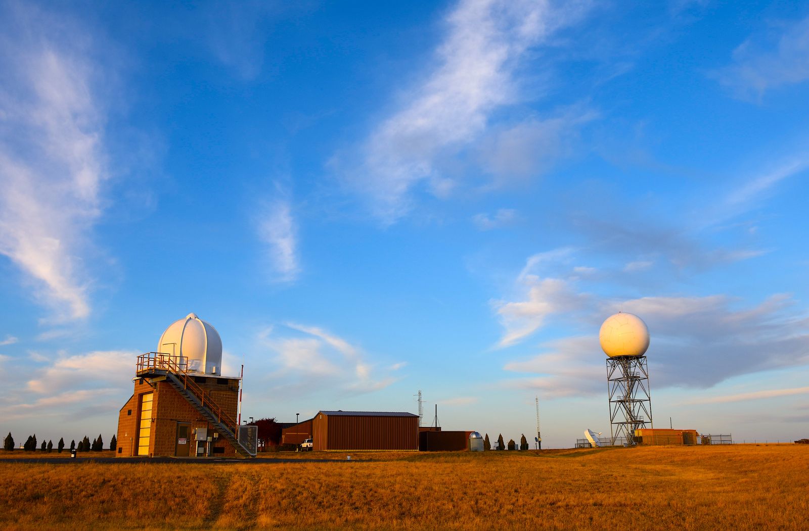
The National Weather Service introduced storm-based warnings for tornadoes, severe thunderstorms, flash floods, and some marine hazards on October 1, 2007. The change allowed local forecast offices to warn portions of counties instead of treating each county as an all-or-nothing area. Official NWS education materials explain that storm-based warnings are meant to show the meteorological or hydrological threat area rather than political boundaries. That is why a warning can cover a diagonal slice of one county, a narrow path across two counties, or a small area around towns and roads in the storm’s path.
Coordinates define the polygon, but the warning text may also describe places in ordinary language: towns, highways, rivers, compass directions, or other landmarks. That matters because people do not experience weather as latitude and longitude. They need to connect the warning to a road they drive, a school they attend, a neighborhood they recognize, or a route they are about to take.
How forecasters draw the shape during a moving storm
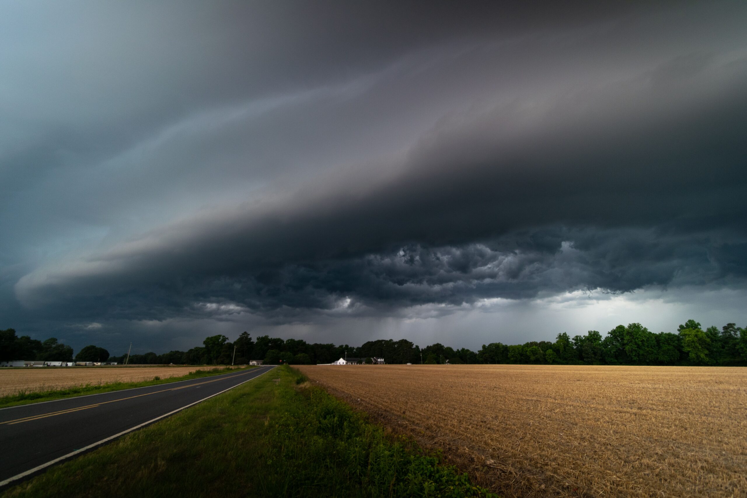
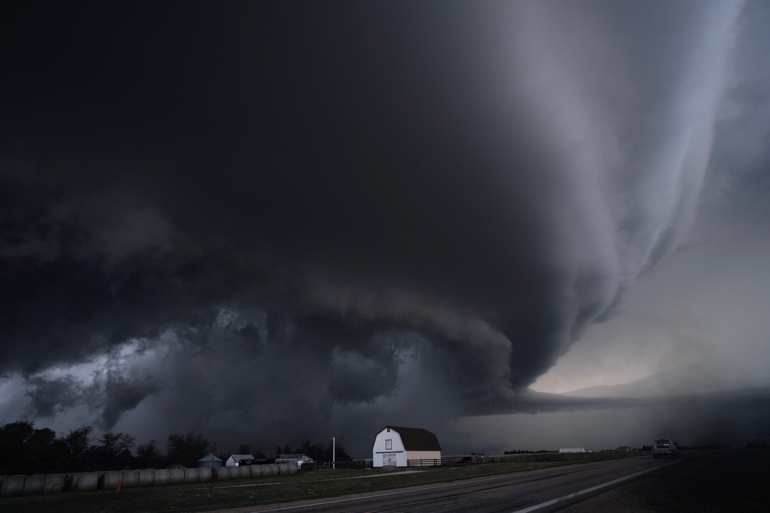
Short-fuse warnings are built under pressure. A tornado warning may last around 30 minutes, while a severe thunderstorm warning often lasts about an hour. During that time, the storm may be strengthening, weakening, changing direction, or producing different hazards in different places. Forecasters use Doppler radar to watch rotation, wind signatures, precipitation structure, and storm movement, then combine that evidence with reports from trained spotters, emergency managers, law enforcement, or the public when available.
The polygon usually points along the expected path of the dangerous part of the storm. If a storm is moving northeast, the warned area may stretch northeast from the current storm location. If the main hazard is wind, the shape may cover the corridor where damaging gusts are expected. If radar shows rotation that could produce a tornado, the polygon may focus on the path of that circulation rather than the whole thunderstorm complex.
That precision does not make the polygon a guarantee. Radar scans arrive in intervals, low-level storm features can be hard to see at a distance from the radar, and storms sometimes change faster than any warning can be updated. A polygon should be treated as the best official threat area at that moment, not as a wall that danger cannot cross. If a storm is near your location, conditions look threatening, or local officials tell you to shelter, it is wise to act even before the line on the map looks perfect.
Why people outside the polygon may still hear alerts
One confusing part of modern weather warning is that the map shape, phone alert, broadcast crawl, and siren system may not all match exactly. The polygon is designed for map-based warning, but many communication systems still use counties, towers, broadcast areas, or local emergency zones. That means someone outside a polygon may still hear about the warning, while someone near the edge may need to check a reliable map or official alert source to see whether they are included.
Outdoor sirens are a common example. They are usually controlled locally and are often designed to warn people who are outside, not to provide room-by-room indoor notice. Some communities sound sirens for an entire city or county when only part of the area is under threat. Other communities use more targeted siren policies. Either way, a siren should not be treated as a detailed map. It is a prompt to seek information and shelter if needed.
Wireless Emergency Alerts can also feel broader or narrower than expected because they depend on cell towers and device behavior. A phone may receive an alert because it recently connected to a tower serving the warned area, or it may receive the message a little after a storm has moved. Weather apps, local media, NOAA Weather Radio, and official NWS pages can help fill in the details, especially when storms are close and updates are changing quickly.
How to read a polygon without getting misled
The first question is simple: is your location inside the polygon? If it is, the warning applies to you, and the next step depends on the warning type. For a tornado warning, the National Weather Service uses clear action language because a tornado has been sighted or indicated by radar. The safest response is to move to an interior room on the lowest floor of a sturdy building, away from windows. For a severe thunderstorm warning, the threat may be damaging wind, large hail, or both, and people should still get inside and away from windows because severe thunderstorms can damage property and sometimes produce tornadoes with little extra notice.
The second question is where the storm is going. Do not look only at the center of the polygon or the town names in the headline. Notice the long direction of the shape, the time stamp, and any text about storm movement. If your location is near the front edge of the polygon, the storm may arrive soon. If it is near the back edge, the strongest part may already have passed, but updates still matter because warnings can be continued, canceled, replaced, or followed by severe weather statements.
The third question is whether you are near the edge. People often treat map lines as if one side is safe and the other side is dangerous, but weather does not behave with that kind of neatness. A tornado path can wobble. Damaging wind can spread wider than expected. Hail size can change quickly. Being just outside the polygon is not a reason to ignore the sky, especially if the storm is approaching or local officials are urging caution.
Why polygons make warnings more useful
Warning polygons are an attempt to balance two needs that sometimes pull against each other. People in danger need fast, forceful notice. People outside the danger area should not be trained to think every alert is exaggerated. A targeted polygon helps forecasters communicate urgency without warning an entire county every time a storm clips one corner of it.
The design also helps schools, hospitals, airports, sports venues, and emergency managers make practical decisions. A school in the polygon may move students to shelter while another school in the same county continues monitoring updates. An airport may pause operations if a warned storm is moving over runways. A family deciding whether to leave a store, pull off the road, or delay a trip can see whether the warning is moving toward them or away from them.
The shape is only one part of the message, but it is a powerful one. A good warning map does more than say that bad weather exists somewhere nearby. It shows who is most likely to face the hazard next, how quickly the situation is unfolding, and why a few minutes of attention can matter. When the sky turns dark and the alert appears, the polygon is not just a graphic. It is a carefully drawn signal to take the storm seriously in the places where time matters most.


Add comment