 Akshay Dinesh
A flat map can show roads, rivers, and town names easily enough, but terrain is harder. A mountain does not fit neatly onto paper. A valley does not announce its depth just because a blue stream line runs through it. Contour lines solve that problem by turning elevation into a pattern readers can follow with their eyes. Once the pattern makes sense, a topographic map stops looking like a maze of brown curves and starts showing the actual shape of the land.
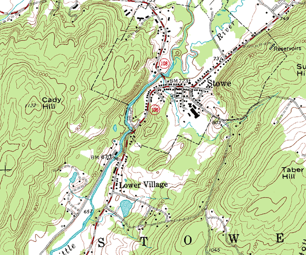
The idea is simple but powerful: each contour line connects places at the same elevation. If a line is labeled 800 feet, every point along that line is 800 feet above the map’s reference level, usually mean sea level. The U.S. Geological Survey describes elevation contours as the distinctive feature of topographic maps because they show height, land shape, and slope on a two-dimensional surface. That one convention lets a map show whether a trail climbs slowly, whether a stream sits in a V-shaped valley, or whether a ridge drops away sharply on one side.
What a Contour Line Really Means
Imagine walking around a hill while trying to stay at exactly the same height the whole time. You might curve around trees, cross small gullies, and circle rock outcrops, but you would never climb above or dip below that chosen elevation. If someone traced your path from above, the line would wrap around the hill. That traced path is the basic logic of a contour line.
Because a contour line represents one elevation, it should be read as a continuous level path, not as a road or fence. The line does not mean the ground is flat everywhere inside it. It means the ground reaches that same height wherever the line passes. Several lines together reveal how the surface rises or falls between them.
The difference in elevation between neighboring contour lines is called the contour interval. A map might use a 20-foot interval, a 40-foot interval, or another value depending on the area and map scale. USGS cartographic guidance notes that flatter areas may use smaller intervals, while steep terrain may need larger intervals so the map does not become crowded with lines. Good map reading always starts by checking the contour interval in the map margin or legend.
Spacing Shows Slope Before Numbers Do
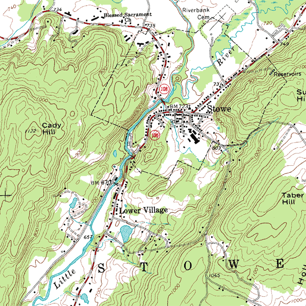
The fastest clue on a topographic map is not the number printed on a line. It is the spacing between lines. When contour lines are close together, elevation is changing quickly over a short horizontal distance. That usually means a steep slope, a sharp hillside, or a cliff-like drop. When contour lines are far apart, the land is rising or falling more gently.
This is why a topographic map can warn a hiker or planner before any calculation begins. A straight-looking route across widely spaced contours may be easy walking. A route crossing many tightly packed contours may involve a hard climb even if the distance on the map looks short. The map is showing two kinds of distance at once: horizontal distance across the page and vertical change through the contour interval.
Index contours make this easier. On many topographic maps, every fifth contour line is drawn darker or heavier and labeled with its elevation. The thinner lines between them still matter, but the darker labeled lines help readers count elevation changes without labeling every curve. If the interval is 20 feet, the lines between 800 and 900 feet mark 820, 840, 860, and 880 feet.
A useful habit is to read slope in three passes. First, look for areas where lines bunch together. Second, find the labeled index contours so you know whether the land is rising or falling. Third, connect that pattern with nearby features such as streams, roads, trails, or summits. The map becomes much clearer when the line pattern is tied to real landforms.
How Lines Reveal Hills, Valleys, and Ridges
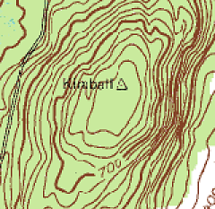
Closed contour lines often show hills, peaks, or basins, depending on the surrounding numbers. If the numbers increase toward the center, the closed shape marks higher ground. If the numbers decrease toward the center, the closed shape may show a depression, sometimes marked with small inward ticks called hachures. Without the elevation numbers, the shape alone can be misleading, so the labels matter.
Valleys often appear where contour lines bend into a V or U shape. When a stream is present, the point of the V usually aims uphill, toward higher elevation. That pattern happens because the stream has cut into the land, pulling the contour lines upstream as they cross the valley. Ridges can create the opposite impression: contour bends point downhill as the high ground projects outward.
These patterns are more than map trivia. They help readers picture water movement and terrain barriers. Rainfall tends to drain down valleys, not across ridgelines. Roads and trails often choose gentler passes rather than climbing directly over the tightest contour lines. In emergency planning, engineering, hiking, and field science, those shape clues can matter as much as named landmarks.
Contour Lines Work With Scale, Symbols, and Benchmarks
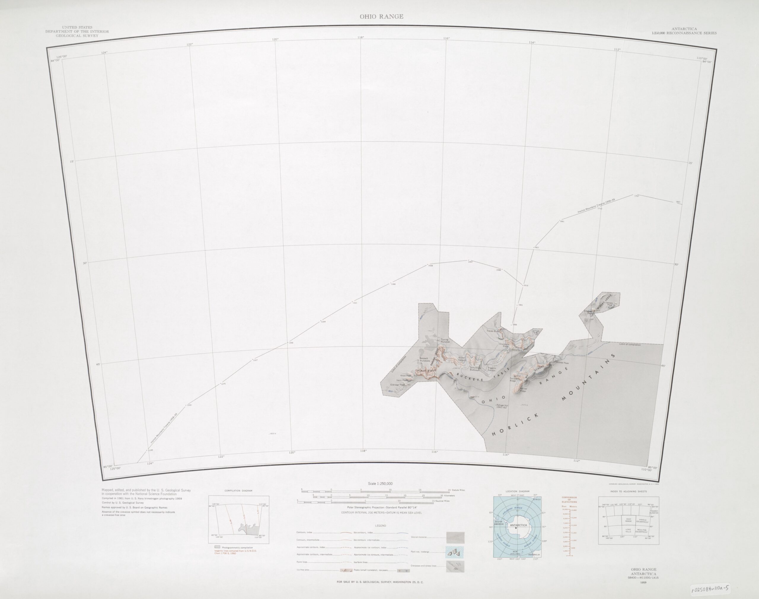
Contour lines do not explain a map by themselves. Scale tells how much real-world distance is represented on the page. Symbols identify roads, trails, water, buildings, boundaries, vegetation, and other features. Together, these details let a reader move from a rough impression of terrain to a more practical understanding of place.
Benchmarks and spot elevations add another layer. A benchmark is a surveyed point with a known elevation, often shown by a small symbol and number. A spot elevation marks the height of a specific location such as a summit, road crossing, or pass. These point measurements help anchor the broader contour pattern, especially where a single exact height matters.
Modern topographic maps are built from many data sources, including elevation datasets, hydrography, transportation layers, boundaries, and place names. USGS’s current US Topo series draws from The National Map and continues a mapping tradition that stretches back more than 140 years. The tools have changed, but the reader’s central task remains familiar: compare symbols, scale, and contour patterns to understand the land.
A Practical Way to Read a Topographic Map
Start with orientation. Find north, the scale, and the contour interval before studying the terrain. Then look for the highest and lowest labeled contours in the area you care about. This gives a quick sense of relief, which is the difference between high and low ground.
Next, trace the water. Streams are natural guides because they flow downhill and often sit in valleys. If contour lines form V shapes along a stream, check which way the V points and compare that with the labeled elevations. This helps reveal drainage direction even when the map does not show arrows.
After that, study possible routes. A route that follows a contour line stays near the same elevation. A route that crosses contours climbs or descends. Crossing a few widely spaced contours may be manageable; crossing many tightly packed contours signals a much steeper change. This is why a short path on a map can still be physically demanding.
Finally, connect the contour pattern to real decisions. A campsite near the bottom of a steep drainage may be vulnerable to runoff. A ridge may offer views but also exposure to wind. A road that snakes across a slope may be avoiding a direct climb. The map is not merely showing where things are. It is showing how the land behaves.
Why Contour Reading Still Matters
Digital maps have made navigation feel effortless, but they can hide terrain behind a smooth blue route line. A topographic map asks readers to notice the land itself. It shows why two places close together on a screen may be separated by a steep climb, a ravine, or a ridge. It also builds a habit of looking beyond the easiest path and asking what the ground is doing.
Contour lines reward patience. At first they look busy, but the pattern becomes readable with practice: close lines for steep slopes, wide spacing for gentle ground, closed loops for hills or depressions, V shapes for valleys, and labels that reveal direction. Once those clues click, a flat map begins to feel almost three-dimensional. The page has not changed, but the reader has learned how to see elevation inside it.