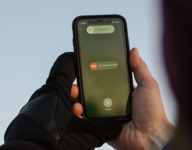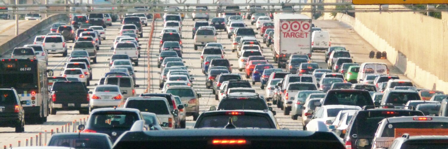
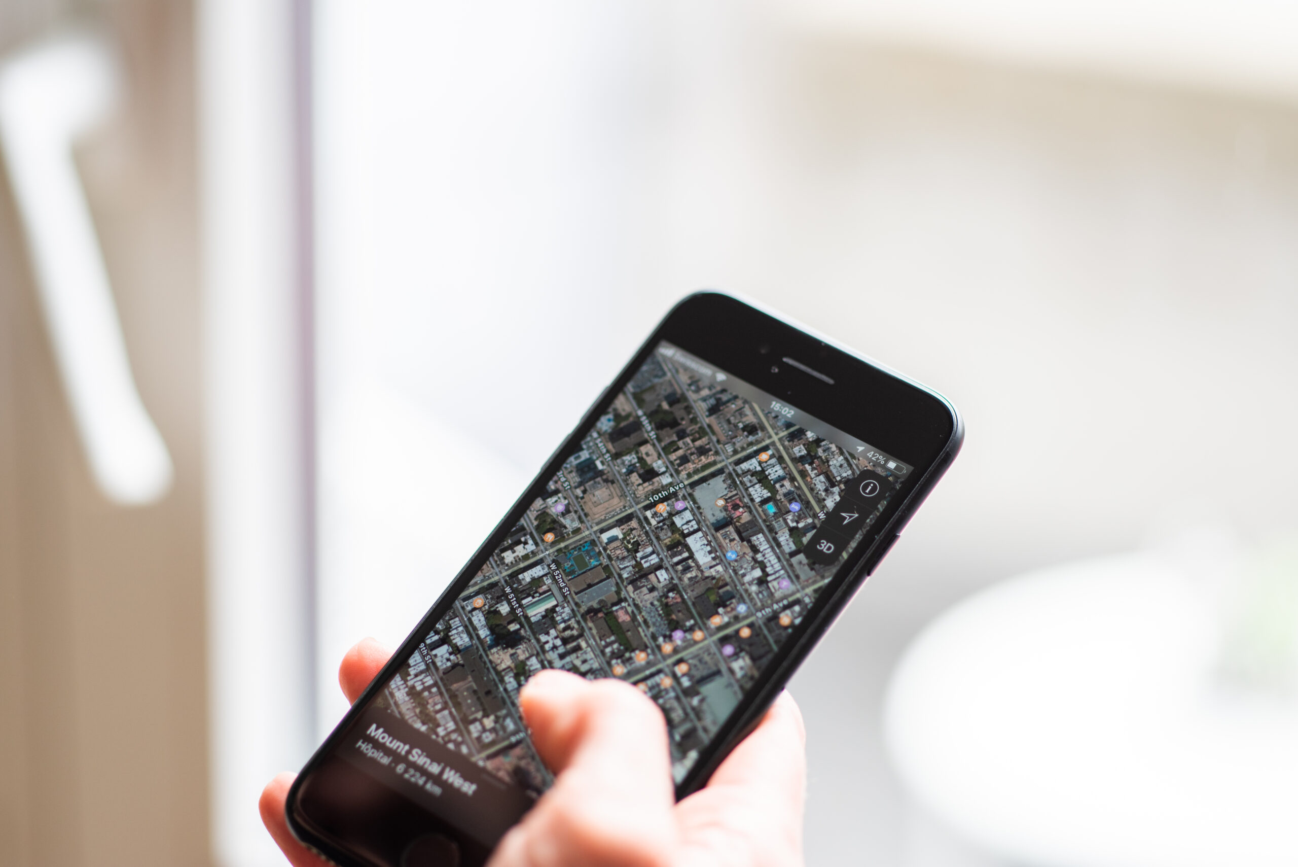
On a busy afternoon, a digital map can seem almost too aware. A road that looked clear a few minutes ago turns orange. Another route flashes red. The arrival time jumps, then settles again after the app finds a side street or a faster highway entrance. The map is not seeing every car the way a person sees traffic from a bridge. It is building a live estimate from many partial signals, then comparing those signals with what usually happens on that road at that time.
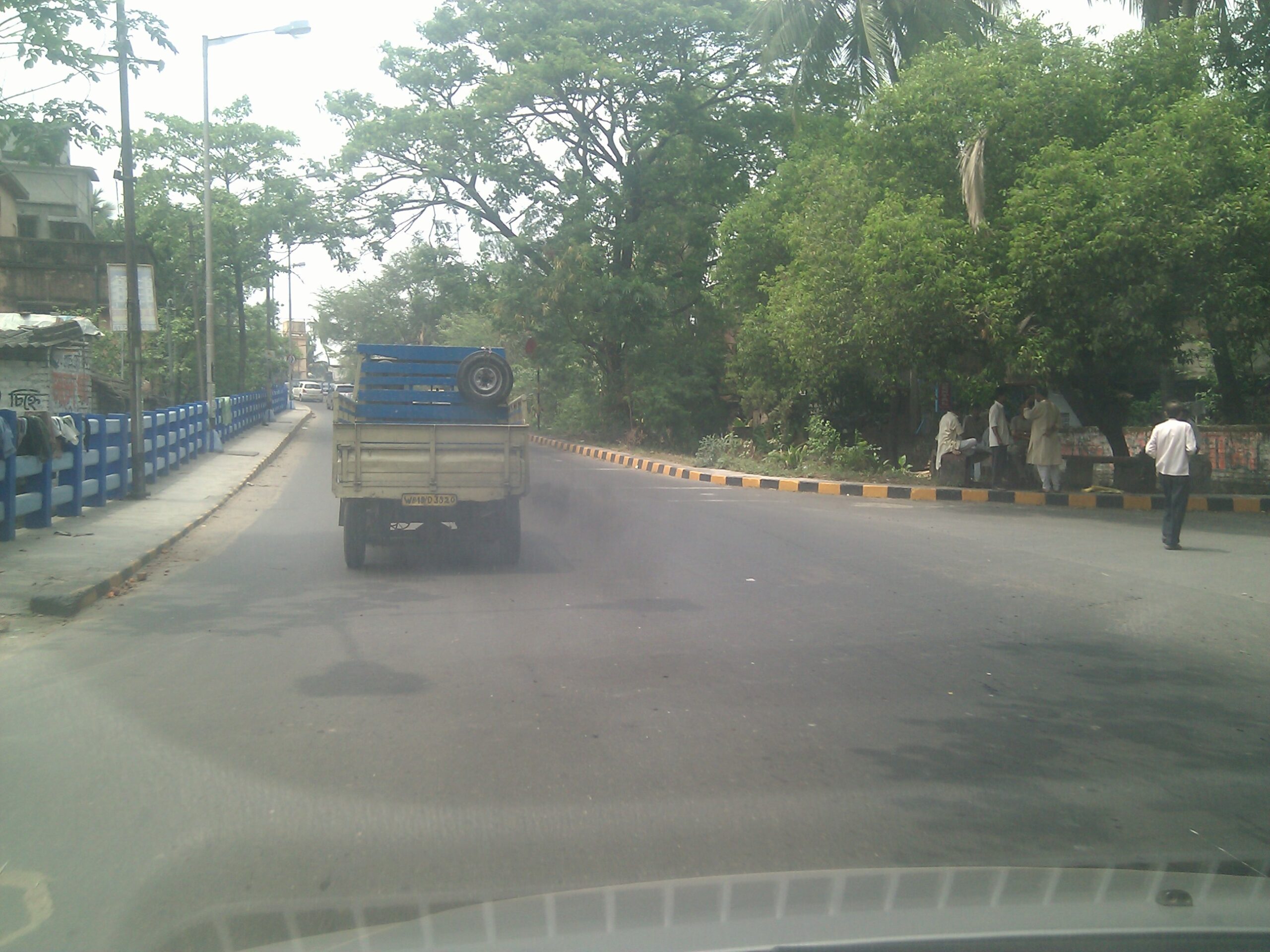
That estimate is useful because traffic is not only about how many cars are on a road. It is about speed, road design, signal timing, crashes, construction, weather, lane closures, and driver behavior. A traffic map has to turn all of that messy movement into a simple visual language: green for flowing traffic, orange for slower movement, red for delays, and darker red for very slow roads. Behind those colors is a chain of measurement, filtering, prediction, and routing.
The colors are really speed comparisons
The colored lines on a traffic map do not simply mean “many cars” or “few cars.” They usually describe how fast traffic is moving compared with what the road can normally handle. Google Maps Help, for example, describes green as no traffic delays, orange as a medium amount of traffic, and red as traffic delays, with darker red showing slower speeds. That simple code matters because a crowded downtown street and a crowded interstate do not have the same normal speed.
A road can look busy and still stay green if vehicles are moving close to the expected pace. A different road may turn red even with fewer cars if those cars are crawling through a bottleneck. The map is judging the road against a baseline, not against a photograph. That baseline may include posted speed, typical travel speed, road type, intersection spacing, and historical behavior for that exact stretch.
This is why traffic colors can change so sharply near ramps, tunnels, bridges, school zones, and stadium exits. A short segment may slow down before the rest of the road does. If enough data suggests that travel time through that segment has changed, the map can color that part differently from the streets around it.
Phones and connected vehicles act like moving probes
One of the most important sources of live traffic information is movement data from devices and vehicles that are already traveling. Transportation engineers often call this probe data. The Federal Highway Administration describes probe-based systems as methods that monitor the position of vehicles over space and time, including GPS or cell-phone based probes. In plain language, a moving phone or connected vehicle can help reveal how fast traffic is moving without a sensor being buried in every lane.
The map does not need to know the story of each driver to learn something useful from the pattern. If many devices that appear to be on the same highway segment are moving near 60 miles per hour, the road is probably flowing. If those devices suddenly slow to 18 miles per hour in the same place, the map has a strong clue that congestion, a crash, a lane closure, or a signal backup may be affecting traffic.
This kind of data is powerful because it travels with the road users. Fixed sensors can count vehicles at one point, but a probe can show how long a trip takes across several miles. That helps navigation systems estimate travel time, not just traffic volume. A driver cares less about the exact number of cars on the road than about whether the next ten miles will take twelve minutes or forty.
Probe data has limits. Not every driver shares location information, not every road has enough devices to create a reliable sample, and phones can be inside buses, parked cars, trains, or buildings near a road. The system has to filter bad signals before it trusts a pattern. A few slow phones near a highway are not enough; many consistent signals are much stronger evidence.
Sensors, reports, and road records fill in the gaps
Traffic maps also use information that does not come from phones. Many highways and city corridors have loop detectors, cameras, Bluetooth readers, toll-tag readers, radar units, or other traffic-monitoring equipment. Transportation agencies use these systems to estimate speed, count vehicles, detect backups, and manage signals. Some of that information can feed traveler information systems and traffic data providers.
Incident reports add another layer. A crash, stalled vehicle, closed lane, work zone, flooding, or police activity can slow a road before the speed data fully catches up. User reports can help, too, especially when many drivers mark the same issue in the same place. The map has to weigh those reports carefully because a single outdated warning should not override stronger live speed evidence.
Historical traffic patterns are just as important. A road that is slow every weekday at 5:15 p.m. is different from a road that suddenly slows at midnight. By comparing live speeds with typical speeds for the same road, day, and time, a traffic system can recognize what is ordinary and what is unusual. That is why some maps can estimate travel time for a trip planned later in the day, even before the future traffic exists.
The route is a prediction, not a promise
Once a map has an estimate for each road segment, it still has to choose a route. That is an algorithm problem. The app treats the road network like a connected system of segments, each with a cost. The cost might include distance, speed, turn difficulty, traffic lights, highway ramps, tolls, restrictions, and current delays. The “fastest” route is the path with the lowest expected travel time, not always the shortest distance.
Small changes can matter. If a crash adds ten minutes to a highway, a side route may become faster. If that side route has many signals or a school dismissal, the highway may still win. A navigation app keeps recalculating because the cost of each road segment can change. The ETA shifts when new evidence changes the balance.
There is also a crowd effect. When many drivers receive the same alternate route, the detour can become busier. Navigation systems try to account for changing conditions, but they cannot fully control what thousands of people decide to do at once. A clever shortcut at 4:40 may be crowded by 5:05 because enough drivers followed the same advice.
Good routing also has to avoid absurd precision. A map may say a trip will take 23 minutes, but that number is still an estimate. A traffic signal cycle, a slow left turn, a delivery truck, a lane merge, or a sudden shower can change the real result. The number feels exact because it is displayed exactly, but it is built from probabilities.
Why maps sometimes get traffic wrong
Traffic maps usually improve when they have more reliable signals, but several situations can confuse them. A road with very few drivers may not produce enough live data. A new construction pattern may not match the historical record yet. A crash may clear before the map removes the warning. A large event can send traffic onto roads that are normally quiet, making old patterns less useful.
Location accuracy can also create errors. In dense downtown areas, signals may bounce off buildings or place a device on the wrong parallel street. On stacked highways or frontage roads, a phone may appear close to two possible routes. The system has to decide which road the device is probably on, and that decision is not always perfect.
Another challenge is privacy. Traffic maps need enough location information to estimate movement, but responsible systems also have to reduce personal identifiability and avoid showing a single traveler as if that person were the data. Aggregation, sampling, delay, and filtering help turn individual movement into road-level patterns. For readers, the key idea is that a traffic color is a summary of many signals, not a direct window into one driver.
The best way to read a traffic map is to treat it as a skilled estimate. Green, orange, and red are not magic labels. They are the visible surface of live speeds, road sensors, incident reports, historical patterns, and routing algorithms working together. When the map changes its mind, it is usually responding to new evidence. That can be annoying when the ETA jumps, but it is also the reason the map can warn you about a slowdown before you reach the brake lights.