
 Akshay Dinesh
A good map is more than a picture of a place. It is a carefully designed way of turning distance, direction, landforms, borders, data, and movement into something a reader can understand at a glance. That is why mapping skills still matter in a world full of phone navigation. GPS can tell you where to turn, but a map can show why a route makes sense, how places relate to one another, and what patterns might be hidden in the landscape.
Reading a map well means asking a few steady questions: What area does this map show? What kind of information is it trying to explain? How much has been simplified? Once those questions become habits, maps become useful tools for school, travel, outdoor safety, history, environmental science, and everyday decision-making.
Maps Begin With Purpose
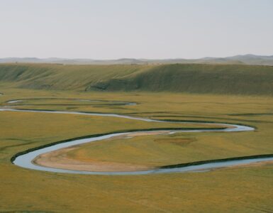
Every map leaves things out. That is not a flaw; it is how maps work. A political map highlights borders, capitals, and regions because its purpose is to show government boundaries. A physical map emphasizes mountains, rivers, plains, deserts, and coastlines because it is built to show natural features. A road map simplifies the landscape so drivers can focus on routes, exits, and distances.
Thematic maps go a step further by focusing on one subject, such as population density, rainfall, earthquake risk, languages, voting patterns, or land use. These maps are powerful because they turn data into geography. A population map, for example, can reveal why cities grow near coasts, rivers, rail lines, or major highways. A climate map can help explain why farming looks different in dry interior regions than it does in wetter coastal areas.
The first skill, then, is not memorizing map types. It is noticing the map’s job. If you know what the map is designed to show, you are less likely to misuse it. A subway map may be excellent for planning train transfers, but it usually distorts distance and direction. A weather map may show pressure systems beautifully, but it will not help you judge the steepness of a trail.
Scale, Symbols, and Direction
Three features make most maps readable: scale, symbols, and direction. Scale tells you how distance on the map relates to distance in the real world. It may appear as a ratio, such as 1:50,000, or as a bar that shows miles or kilometers. A large-scale map shows a smaller area with more detail, such as a neighborhood or hiking trail. A small-scale map shows a larger area with less detail, such as a continent or the whole world.
Symbols act like a visual vocabulary. Blue lines may show rivers, thin gray lines may show smaller roads, shaded relief may show mountains, and dotted lines may show borders or trails. The legend, sometimes called the key, explains these choices. Skipping the legend is one of the quickest ways to misread a map, especially when colors or symbols have a special meaning for that map.
Direction matters just as much. Many maps place north at the top, but that is a convention, not a law of nature. A compass rose or north arrow confirms orientation. On a street map, direction helps you compare routes. On a topographic map, direction combines with contour lines to help you understand where slopes rise or fall. These small details turn a flat page into a usable model of space.
Why Flat Maps Distort the World
Earth is roughly spherical, but paper, screens, and classroom wall maps are flat. Moving from a curved surface to a flat one always creates distortion. This process is called map projection, and every projection makes a tradeoff. Some preserve shape fairly well, some preserve area, some preserve direction, and some try to balance several distortions at once.
The Mercator projection, for example, is useful for navigation because it represents constant compass directions as straight lines. But it greatly enlarges areas near the poles, which is why Greenland can look much closer in size to Africa than it really is. Equal-area projections make a different choice: they keep relative land area more accurate, but shapes may stretch or bend. Neither map is simply right or wrong. Each answers a different question.
This is where map reading becomes critical thinking. If a map seems to make one region look unusually large, central, empty, crowded, powerful, or isolated, the design choices may be shaping that impression. Projection, color, labels, boundaries, and data categories all influence what a reader notices first.
GPS and Digital Maps
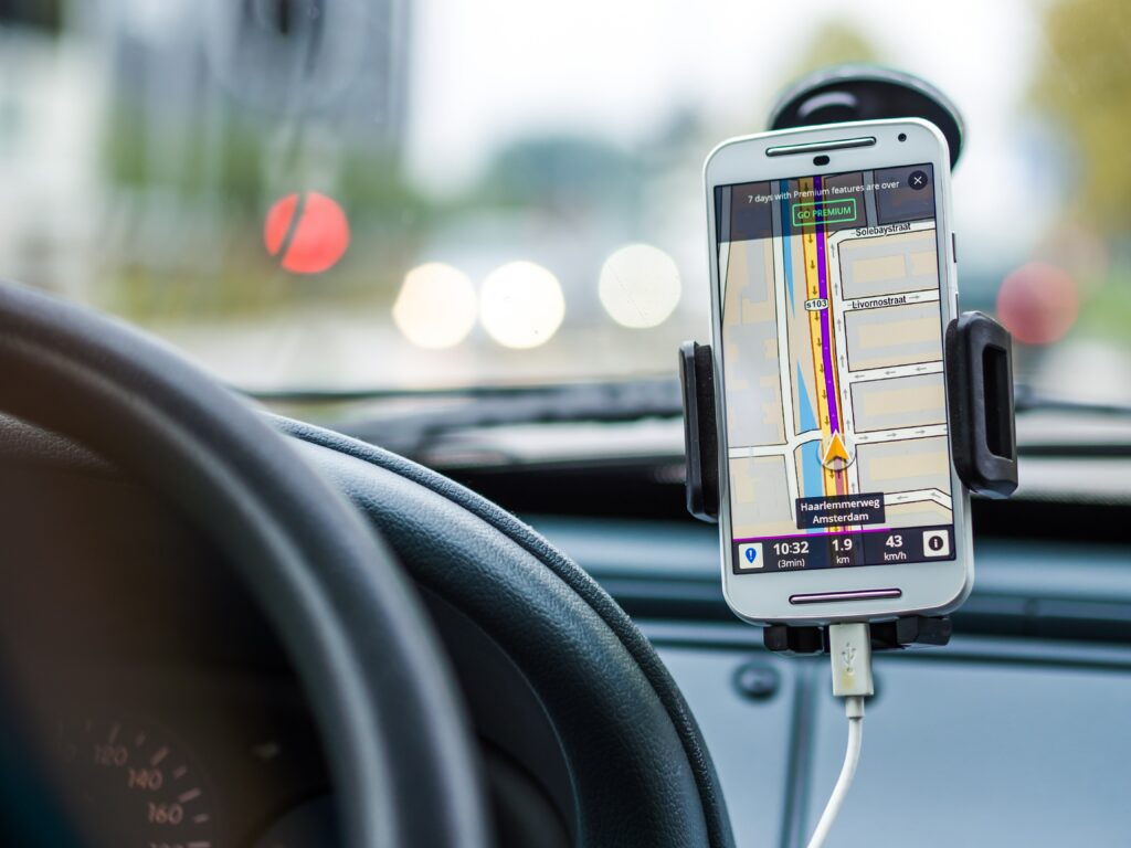
Digital navigation depends on older mapping ideas, but it adds satellites, sensors, databases, and live updates. GPS, short for Global Positioning System, works by timing signals from satellites. A receiver compares the signal times from multiple satellites to estimate its position on Earth. In normal use, at least four satellite signals are needed to calculate location and account for timing differences.
That location is only part of the story. A phone map also needs road data, addresses, traffic information, place names, and routing rules. When a navigation app chooses a route, it is combining your position with a digital model of the transportation network. This is why digital maps can update quickly when traffic changes, but they can still make mistakes when roads are newly built, temporarily closed, mislabeled, or poorly mapped.
Strong mapping skills make digital tools safer and more useful. If the suggested route sends you toward a flooded road, a restricted area, or a trail that looks too steep for your plan, the map reader still has to think. The best habit is to use digital directions as information, not as a substitute for judgment.
How GIS Turns Maps Into Analysis
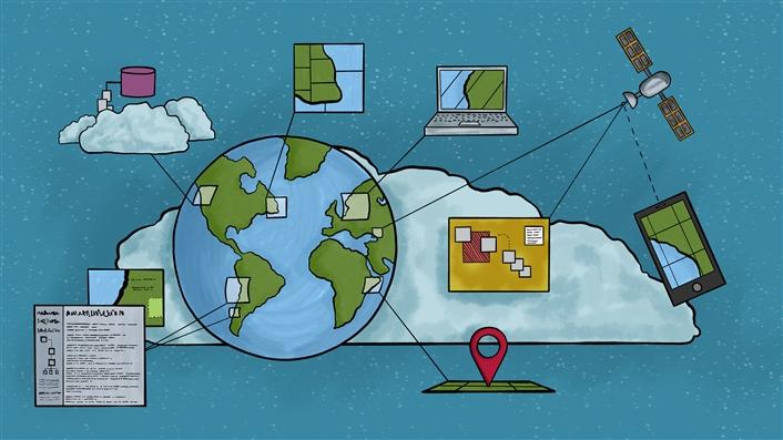
GIS, or Geographic Information Systems, expands maps from static displays into tools for analysis. A GIS can combine layers of information: roads, rivers, elevation, satellite imagery, census data, property lines, land cover, pollution readings, or storm risk. Each layer can be studied on its own, but the real power comes from seeing how layers relate.
Urban planners might use GIS to decide where a new bus route would serve the most people. Emergency managers might compare flood zones with roads, hospitals, and neighborhoods. Environmental scientists might use satellite imagery and field data to track deforestation, coastal erosion, wildfire damage, or water quality. In each case, the map is not just showing where things are. It is helping people reason through a problem.
For students, the same mindset is useful even without advanced software. A strong map reader looks for patterns, compares places, checks scale, reads the legend, asks what data is missing, and notices how design choices affect interpretation. Those habits make maps more than classroom objects. They become a way to understand movement, resources, risk, culture, environment, and change.
Maps simplify the world, but they do not make it smaller. They give us a way to hold complex places in view long enough to ask better questions. Whether the map is printed on paper, opened on a phone, or built from layers of geographic data, the essential skill is the same: read carefully, notice what the map is trying to show, and think about what it cannot show on its own.