 Akshay Dinesh
A histogram can make a pile of numbers feel suddenly readable. Instead of asking a reader to scan every test score, rainfall total, commute time, or survey response one by one, it groups nearby values and shows how often each group appears. The result is a shape: maybe a mound in the middle, a long tail to one side, two separate peaks, or a lonely bar far away from the rest.
That shape is useful, but it is not magic. A histogram is built from choices, and the most important choice is how wide the groups should be. Those groups are called bins. Make the bins too wide, and the chart may smooth away details that matter. Make them too narrow, and the chart may look noisy, as if every tiny bump deserves attention. Learning to read a histogram means learning to read those choices too.
What a Histogram Actually Counts
A histogram is used for numerical data, not categories. If a class records each student’s commute time to school, a histogram might count how many commutes fall from 0 to 9 minutes, 10 to 19 minutes, 20 to 29 minutes, and so on. Each bar covers a range of values, and the height of the bar shows how many observations fall inside that range.
This makes a histogram different from a bar chart. In a bar chart, the bars usually represent separate categories, such as favorite subjects or types of transportation. The order of those bars can often be rearranged without changing the meaning very much. In a histogram, the order matters because the x-axis is a number line. The bars sit next to each other because the intervals are continuous neighbors.
The NIST/SEMATECH engineering statistics handbook describes a histogram as a way to summarize the distribution of one numerical variable. That word, distribution, is the heart of the chart. A histogram is not only asking what the values are. It is asking where the values gather, how far they spread, and whether the pattern has a shape worth noticing.
How Bin Width Changes the Picture
Imagine 30 students took a quiz scored out of 100. If the histogram uses bins of 20 points, the chart may show only five broad bars: 0-19, 20-39, 40-59, 60-79, and 80-100. That might be enough to see whether most scores are high or low, but it may hide the difference between a cluster around 72 and a cluster around 88. Both would sit inside the same broad upper range.
Now imagine the same data with bins of 5 points. The chart shows much more detail, but some bars may be empty and others may hold only one student. A small movement from 84 to 85 can move a score into a different bar even though the real difference is tiny. The chart may start to look like a jagged fence instead of a useful summary.
A good bin width balances detail with readability. The goal is not to force the data into the smoothest possible shape or the most dramatic one. The goal is to choose intervals that match the question. A teacher looking for broad class performance bands may use wider bins. A researcher checking whether measurements cluster around several values may need narrower bins.
The Shape Can Reveal More Than the Average
A single average can hide a lot. Two classes can have the same mean quiz score while looking very different when graphed. One class might have most students near the average, with only a few higher or lower scores. Another might have one group that struggled and another group that did very well, leaving the average in a place where almost nobody actually scored.
Histograms help reveal that difference because they show shape. A symmetric histogram has roughly balanced sides. A right-skewed histogram has many lower or middle values and a longer tail stretching to the right, such as household incomes in many communities. A left-skewed histogram has the tail stretching to the lower side, which can happen when many scores are near a maximum but a few are much lower.
Sometimes a histogram has two peaks. That can be a clue that two groups have been mixed together. For example, a histogram of commute times might show one peak for students who live near school and another for students who travel from farther away. The average commute time would be real, but it would not explain the daily experience of either group very well.
Gaps, Clusters, and Outliers Deserve Questions
The most useful part of a histogram is often not the tallest bar. It may be a gap, a cluster, or a value far from the rest. A gap can suggest a boundary in the real world, such as a bus schedule that makes certain commute times uncommon. A cluster can show where typical values gather. An outlier can point to an unusual case, a measurement error, or an important exception.
These features should start questions, not end them. If a histogram of plant heights has one very tall value far from the rest, it could be a genuinely unusual plant. It could also be a typo, such as recording centimeters as inches. If a histogram of wait times has a long right tail, it may mean most people are served quickly but a few experience serious delays. The chart does not explain why by itself, but it helps show where explanation is needed.
Bin choices matter here too. A gap can disappear if the bins are too wide. An outlier can look less unusual if it gets grouped with several values that are merely high. That is why careful readers do not treat a histogram as a finished verdict. They treat it as a map of where to look next.
How to Read a Histogram Carefully
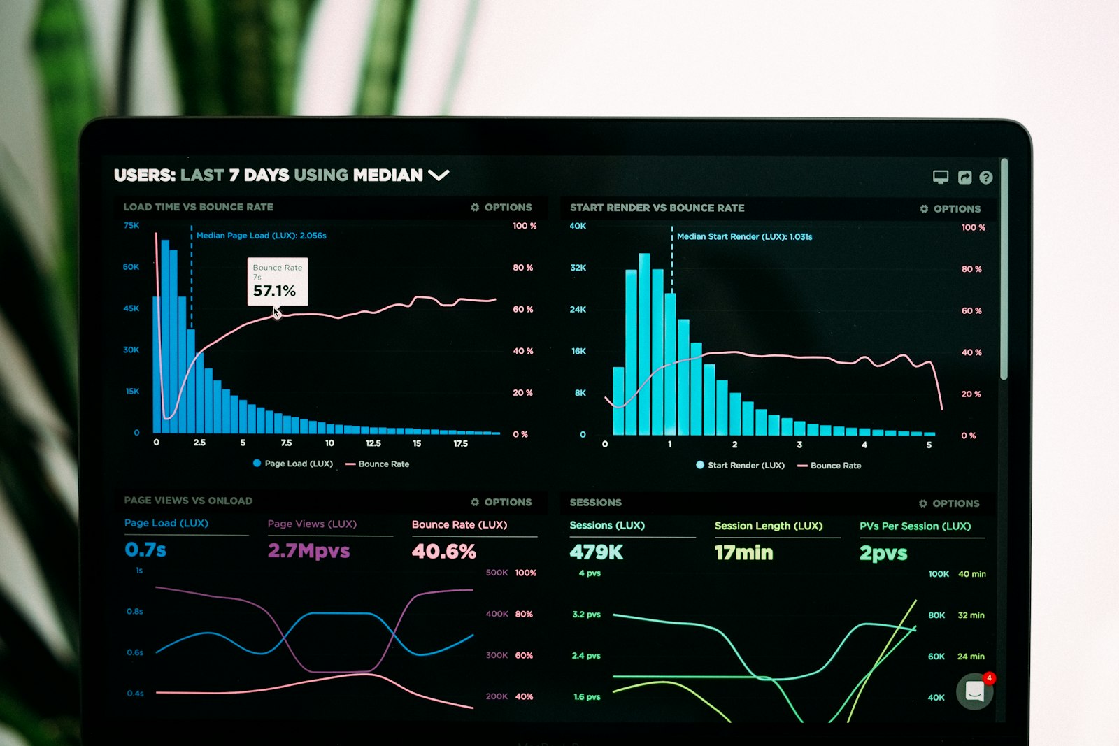
The first step is to read the axes. Check what variable is being measured and what each bin covers. A histogram of ages grouped by decades tells a different story from one grouped by single years. A histogram of rainfall in inches means something different from one showing the number of rainy days. The label tells you what the bars are counting.
Next, look at the overall shape before focusing on individual bars. Ask whether the data are mostly centered in one place, spread widely, skewed to one side, or split into more than one cluster. Then look for odd features: empty spaces, sudden jumps, or values far from the rest. Those details are easiest to understand after the larger pattern is clear.
Finally, ask whether the bin width seems reasonable for the data and the question. If the chart feels too smooth, important differences may be hidden. If it feels too jagged, the bins may be so narrow that random variation dominates the view. When possible, compare the same data using a few different bin widths. If the main pattern survives those changes, it is probably more trustworthy.
Why This Matters Beyond Math Class
Histograms appear anywhere people need to understand many measurements at once. A hospital might use one to study patient wait times. A city might graph noise levels, traffic speeds, or daily water use. A scientist might use histograms to compare measurements from an experiment. A student might use one to understand grades, practice times, reading minutes, or survey responses.
The chart’s strength is also its risk. Because a histogram turns many numbers into one clean picture, it can feel more certain than it is. A poor bin choice can make a pattern look stronger, weaker, smoother, or stranger than the raw data justify. That does not make histograms unreliable. It means they reward careful reading.
A good histogram does not replace the data. It gives the data a shape that the eye can inspect. Once you know what bins are doing, you can read that shape with more confidence. You can notice the center without ignoring the spread, spot unusual values without overreacting to noise, and ask better questions about what the numbers are actually showing.